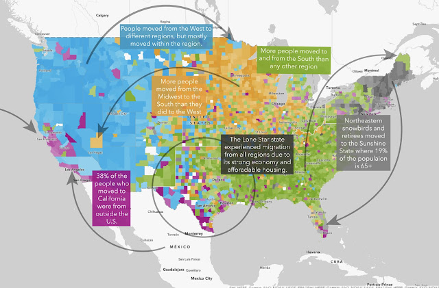
The answer to where people are moving depends upon the data source. Here are some interesting sites to see where people from different cities and state are moving from and to.
The last couple of years has upended the flow of people into cities like Portland and Seattle. Though no exact explanation is given for the dramatic change, it is easy to trust one’s instincts and assume the decline in safety and overall quality of life in these cities has a lot to do with their fading popularity
Incoming migration to the Northwest from LA and SF continues to be strong, probably due to less expensive housing options with relatively similar progressive political and social leanings. Of course, more people coming from Blue cities and states only make Seattle and Portland bluer.
Given the flight from these failed locations, how long can Portland survive as a decent place to live? For the many who have left already, the tipping point has come and gone. Since Portland politics control the state, the bloom is off the once beautiful Oregon rose. Oregon is now only preferable to someplace more horrible - like crime-ridden, high poverty, high tax, expensive Los Angeles.
Like any data, be aware of when charts and maps were created. Things change quickly and you don’t want to depend on information that is out of date. On the other hand, it is fun to look back and see where things were and how much change has occurred and in which direction.
Housing and migration data drawn from Redfin users.
A plethora of maps showing a huge variety of information! Great site to explore.
Visual proof that Oregon’s culture has been altered by an influx of Californians over many decades. We used to depend upon months of uninterrupted overcast skies and plenty of liquid sunshine to drive away the southerners. With summers getting warmer, you can pick out the Johnny-come-latelys by how much they proclaim their love of the heat! True Oregonians don’t like temperatures over 78.
Interesting data in visual form with instructions on how to create charts, graphs, maps and more for your own use.
Statistics and data shown in static and interactive maps. Colorful, easy to read and understand with useful information.


No comments:
Post a Comment